October 24, 2017
Observed 011
What happened on a national level happened locally as well, with police budgets eclipsing funding for social services in city after city. ‘As resources committed to benefits decline,’ Tainter wrote in 1988, ‘resources committed to control must increase.’


The debt-laden buyouts privatize gains when they work, and socialize losses when they don’t…

Jonathan Swift is prompted to publish this piece, “The Benefit of Farting Explain’d,” in 1722 because he has found that ever since women have begun drinking tea and coffee they have been suffering from a “Train of Distempers, scarce known to our Forefathers” and “as universal among us as the Small Pox.” He thinks it is dangerous to the health of women to drink coffee and tea. But he does agree that coffee in the mornings at home “promotes free Circulation of Intelligence” in women since they are forbidden from expressing that intelligence in the public coffee houses. Coffee houses were first established in England in Oxford, by a Jewish entrepreneur named Jacob in 1652 (Wikipedia).
This is a work of satire, but it does take the usual form of a “wise” man talking down to everyone else while simultaneously making themselves sound like they are merely motivated to help instead of criticize. The work is predominately sexist to our modern eyes. At the time, Swift was criticizing the taboo of farting that was cropping up in polite society. The taboo still exists.
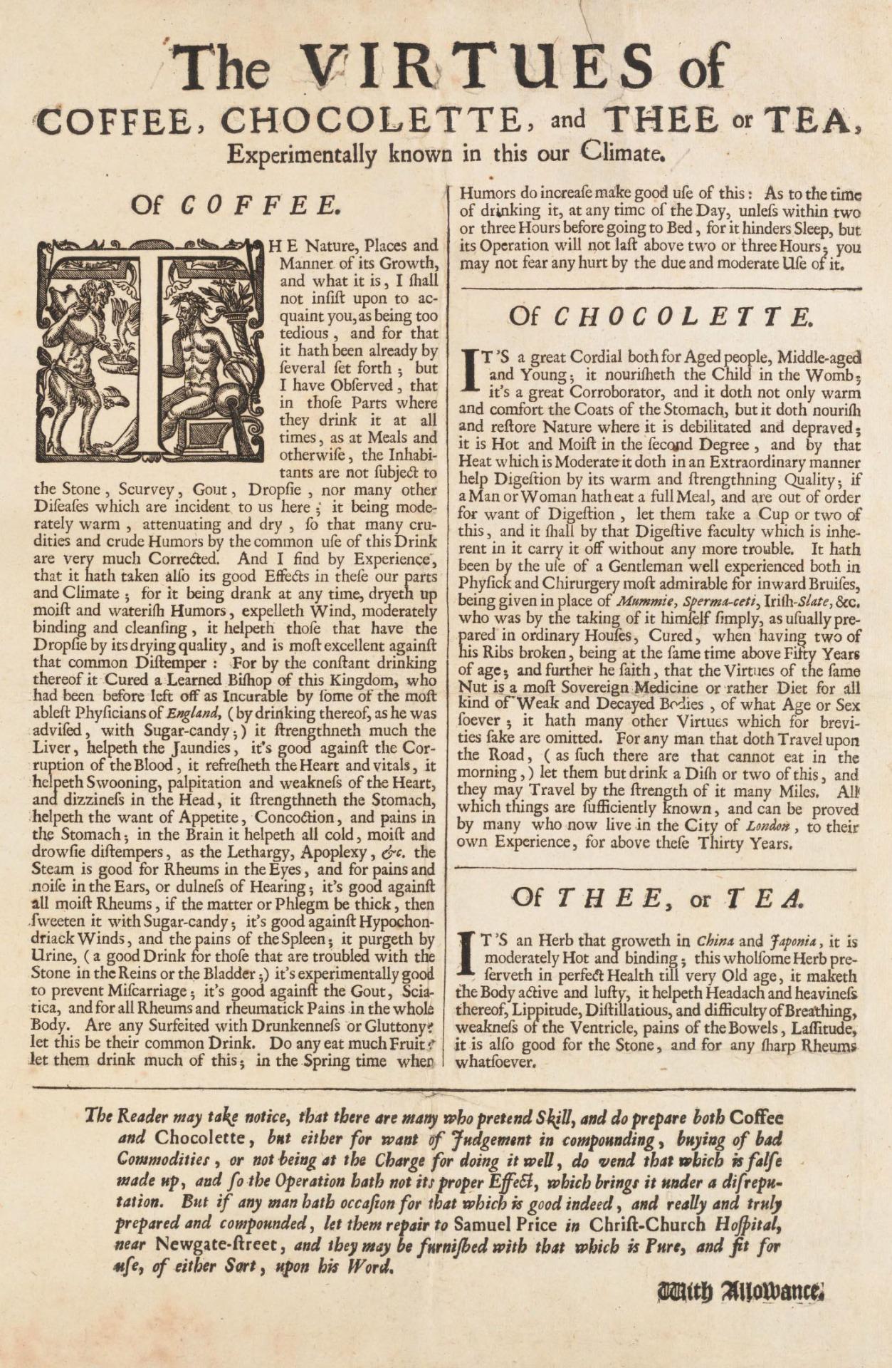
But on another level, this also represents the rapid adoption of tea, coffee, and chocolate into European diets and people’s reactions for or against it. Just a cursory look at books from this period tells one of the drama around these new imports:
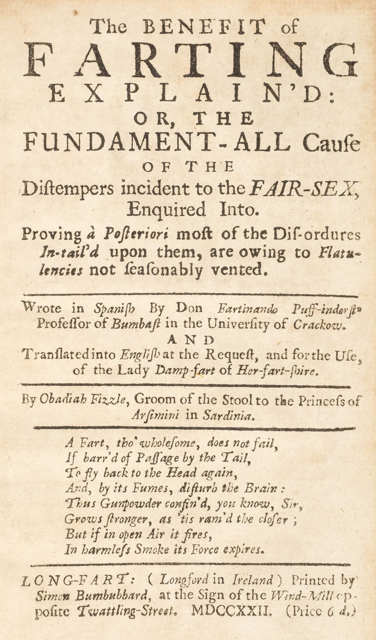

Thus, since the drinking of coffee and tea also causes ingestion of air, the author argues that more and more farts are being produced inside the bodies of women. One “reasonable FART” might prevent all the diseases that women force upon themselves by holding their farts in. Yes, indeed, the idea that women do not poop or fart has persisted since at least 300 years ago.
If one does not fart, it is the “first cause of Quakerism, and Enthusiasm.”
Jonathan Swift then designs to go about the topic thusly: first, to explain the substance of a fart; secondly, to “shew the ill Consequences of suppressing it;” thirdly, to prove it’s lawfulness; and fourth, the benefit of farting.
First, the author brings up a debate amongst scholars. Is a fart substance or “spirit?” The physicists insist it is purely a “spirit.” It must be a spirit, because a fart, which hardly weighs a “thousandth part of a Grain” will “in one Minute, expand itself so far, as to occupy the whole Atmosphere of a large Drawing Room.” That is certainly true.
The chemists claim it is a substance since it’s sulphuric smell can be both ignited and detected by the nose. A certain Cartesius claims to have cooked it up into a sort of saltpeter according “to the French Taste” and used it for gunpowder but unfortunately “blew up” his beliefs.
The mathematicians argue a middle ground: a fart is a quantity (as the chemists claim) but it is indivisible (as the physicists claim).
Jonathan Swift thus defines a fart as “A Nitro-aerial Vapour, exhal’d from an adjacent Pond of Stagnant Water of a Saline Nature, and rarified and sublimed into the Nose of a Microcosmical Alembic, by the gentle Heat of a Stercorarious Balneum, with a strong Empyreuma, and forc’d through the Posteriours by the Compressive Power of the expulsive Faculty.”
My thoughts exactly.
Secondly, Jonathan Swift then claims that the suppression of farts by women “vents itself intirely in Talkativeness; hence we have a Reason why Women are more Talkative than Men.” This is why, he claims, we have the idiom “Tell a Tale, or let a Fart.” The frequent fits of laughing and crying called “vapours” or hysterics is caused by the suppression of farts. When the air travels internally, it first tries exiting as a laugh. If it reaches the top of the head, though, it can turn into tears.
This is ridiculous to read.
Thirdly, Jonathan Swift sets down that farting is not forbidden by any law, and “where there is no Law, there can be no Transgression.” Both the Law of Nature and Cannon Law are for it, but Civil Law is against it until King James I wrote “HERE ALL FARTS ARE FREE” above his castle gate after a man died in his presence from holding in his fart.
If some “Toast of the Town” were to make farting fashionable, then everyone would adopt it. He then goes on to claim the high esteem farting holds in Holland and France.
Finally, the benefit of farting would make women both happier and help them save money on medicines used to cure the symptoms of holding in their farts. Farting can also make others laugh from the occasion. “The Celebrated Author of a Book, called, Laugh and Be Fat, proves Laughing to be a very wholesome Exercise.” The author then goes on to claim that farting was why music has harmony: musicians noted that when two people farted next to each other, they produced different pitches. Listening to a performance of farts at the tea table is much preferable to idle gossip.
Scatological humor, which is what we call poop jokes in academia, was as common in the past as it is today. Mozart, Jonathan Swift, and Benjamin Franklin were all found of writing these jokes in their letters and pamphlets.
The fact of the matter is that even today there are legitimate health articles that need to reassure people that farting is indeed beneficial.
Vain were my hopes: few ſcreens attain the praiſe
Of their great colors, and moſt their colors diſgrace.
But within its ſcreen eternal fire burns,
And all deſigners its poſseſsion so yearn:
And lo, with ſpeed we plough the uncertain way,
To wait once more at the helm of Apple’s bay.


The seller at the farmer’s market was astonished that I was picking the fruits with the most leaves and branches on them. “You know you’ll have to pay the weight for the branches, too.” He didn’t understand. He didn’t see the beauty in the leaves.
A world beyond capitalism would abandon this definition so as to organize social interdependence around the value of spending our time on chosen activities.
Further, “But no one, and certainly not the wretched of the earth, can simply opt out of a system that defines value in terms of wage labor and is oriented toward maximizing not each individual’s free time to spend as she pleases but rather to accumulating ever more capital … Not that labor would ever end or that democracies could never impose labor on their citizens. But work would become mostly a matter of choice, and society would require unchosen work only for the sake of maximizing free time.”

In the corner of this painting is an unmistakable Wedgwood & Bentley black basalt vase with upturned handles. I have not located the exact form, but there are similar ones listed below. The painting dates from 1785.
However, the Metropolitan Museum states that “[a]t first glance, the vase on the mantelpiece seems to be a piece of “Black Basalt” (also called “Egyptian black” or “Etruscan ware”), a refined stoneware colored with cobalt and manganese oxides, invented by Josiah Wedgwood (1730–1795) in 1768; however, the painting’s vase seems to have no exact match among ceramics of the period and may, instead, be made of wood, a less expensive alternative to stoneware but one that would nevertheless have served to indicate the owners’ sophisticated, classicizing taste.”
Recently as of 2020, I have located a Wedgwood vase so strikingly similar to the one in the painting that it must be a form produced at the time. What is interesting about material culture is that the facts and knowledge constantly shift as we uncover more and more objects lurking all over the world.

Similar Wedgwood vases are listed below:
The Qur’an translation I read from start to finish was the one made by a 1900s British convert to Islam, Marmaduke Pickthall. It’s good, if not a little dry, and has good footnotes about the non-chronological order of the Surahs (each chapter, which there are about 114 or so). Each surah usually opens with a description by Pickthall that contextualizes it and sometimes relates it to the Bible.
It is not a very literary translation, so it reads slow and repetitive in a lot of parts (but it maintains good accuracy). Some of the translations from places like Penguin Publishers can be more lyrical to the point of removing the verse numbers (a verse is called an ayah), which is fine, but if someone references a verse then you will not be able to find it. Pickthall also has an index, so you can look up topics rather easily.
If you want something more edgy, you can go for a reformist Turkish translation. This is interesting for two reasons: it treats the Qur’an as the sole legitimate source of Islamic scripture (ignoring other texts and subsequent theology), and it was directed by the Turkish Ministry of Religion as an effort to produce a modern, contextualized translation, so it ruffled some feathers.
A brief history: the Qur’an is the holy book of Islam. However, there are the hadiths or sayings of the Prophet, which equal the Qur’an in importance. These are things the prophet (purportedly) said outside of his Qur’anic revelations, like advice he might have given to an invidual in response to a particular question, general thoughts he vocalized, or remarks he might have made during a Friday sermon. In other words, they are not in the Qur’an and are not technically divine revelation; they are the mundane thoughts of the Prophet. Yet, the hadiths carry the same legitimacy as the Qur’an. This is problematic because anyone can say, “Well, the Prophet once said…” and you could not really look it up anywhere with certainty. Likewise, these hadith are very contextual: it was advice the prophet gave to people in seventh century Arabia. Since the start of Islam, the hadith have been used to fill gaps in the rather vague Qur’an and provide everyday guidance.
Were these hadith every verified? Yes, Muslims since the time of the prophet’s own life realized the issue of authenticity. To address it, they compiled hadiths and wrote down their advice, lineage, and provenance. In the most “legitimate” kinds of hadith, the Prophet is always the first person to speak a hadith. Then, the lineage lays out each person that passed on that information. Authors would then write notes by each person. For example, this person was sometimes a liar, so don’t believe what he transmitted; or, this other person was usually honest, so her advice is generally correct; or, another person was the Prophet’s close family relative and lived with the Prophet, so his tranmissions are always trustworthy.
Now, over the centuries the Qur’an and hadith were mixed interchangeably to create the general belief systems of Moslems, religious schools of thought, and the legal courts of Islamic states.
Fast-forward to Post-Modernism and our era of contextualization and you can see where reformists Moslems might be a little hesitant about hadith: they are not “official,” the authorship is nearly impossible to verify, and they are highly contextual to the time spoken. These are all red flags for a Post-Modern scholarly world.
The solution for the Turkish reformist edition listed above of the Qur’an was to completely ignore the hadith and not let it inflect how they translated the text. Indeed, there is a modern attempt in Turkey (who is trying to figure out how to re-introduce religion into the secular state) to ignore hadith or place them clearly below the Qur’an. It is a lot easier for someone to fabricate hadith than it is to fabricate Qur’anic verses. Fabricated hadith have been an issue fiercely debated by Islamic theologians for centuries.
An example of a much-argued hadith is the restriction that women cannot travel alone outside their locale. In Arabia in the seventh century, the Moslems were waging war: their enemies could kidnap women from the roads and turn them into slaves (so could Moslems). This was a common problem. It was dangerous, and the Prophet, who spoke that advice, was sincerely concerned about the safety of women. However, this hadith has stayed today and is used to often keep women from leaving their homes. In a reformist approach, all the hadith, including ones verified as true like this one would be ignored.
Links above are affiliate links.
Getting a work email is the equivalent of seeing a bill int he mail: you just know it’s a bill without even having to open it because the design communicates that. Close your eyes and imagine a bill in the mail: the thinness of the envelope, the weak security paper, the simple and plain colors and fonts, the glassine address window. Bills can be identified by touch and sight alone without even having to open them.
And the experience of a bill? Bad.
Work emails are similar: the from address, the styling of the message, the time of day you receive it, the way it’s written, the apologetic workplace tone that is both friendly and distant. We all know how work emails read and what they look like.
And the experience of a work email? Well, work. And that’s not fun.
And now marketing companies and experience and design experts are telling us that these emails convert better when your outbound emails look “normal.” Their reasoning is simple: because these emails look like everyday, personal emails, we’re more likely to open them and trust them because they match the style of real emails from friends and colleagues.
There are a few issues there:
A good marketing email is beautiful and convincing. It has clear visual cues in it and clear calls to action. Just like you wouldn’t design a web page or magazine ad with just plain text (in most cases), so too, should your emails embody the experience of your brand and use the full world of visual design. That takes work. But your users will enjoy your emails with actual pleasure and won’t think to themselves, “great, more work.” Don’t send users bills, send them love letters.
There were about eleven of us: a table full of kids, family members, a mother, and a father. I translated back and forth between gulps of water and mouthfuls of food.
Once upon a time in Cappadocia, Nancy and I rented a scooter, took a cheap map, and explored the area nearly a decade ago. I recollect on that trip with a short piece I wrote for Nomad and Jules. I’m itching to go back.


When I first saw a lotus pod, I didn’t believe it was a real plant. I wanted to capture that strangeness in the photos. As a first encounter, the lotus pods are left bare as if they were photographs meant for clinical study. Their strangeness becomes more pronounced in isolation.
Cynicism takes hold when empathy becomes a chore — the only real antidote is activism.
In corporate culture, the terms of service or use have been rapidly developing into manifestos. They blend moral and ethical beliefs that go much beyond their original purpose of legal protection between company and user.
Corporations have certainly taken on moral issues (Apple and privacy, Target and gender, Chik-fil-A and marriage, &c.) in part because of lax court rulings on their personhood and in part because of the strong political pull of the CEOs at those companies.
It only seems sensible that these rules become enshrined in the terms of service and other cultural artefacts (see for example The Aesthetics of Organization). They’ve grown and so too has our appetite for moral guidance from for-profit entities. Airbnb and other companies have made anti-discrimination and gender policies not only an internal HR practice, but fully-public — and possibly legally-binding — rules that govern not only their own employees but now (and here’s what is so interesting) the behavior of their end users.
People and regular users are regulated now by yet another set rules that govern their behavior on private platforms (mostly for better, maybe for worse), which adds another institutional layer of ethics to human behavior.
Like many of my projects, I created the majority of messaging and writing as well as design. In my mind, the two are quite inseparable. Graphic design, after all, only develops in symbiosis with industrialism, consumerism, and modern marketing. Before then, no such profession exists. The closest we get to “graphic design&dquo; as a profession is in bookmaking. The closet we get to branding is in publishing once again and heralds and the use of emblems by the nobility.
Graphic design is part of the democratization of consumption engendered by the industrial revolution. At the core of it, it is the communication of availability to a market. Communication: spoken, written, heard, touched, or smelled is the core of good design. Without centralized bureaucracies of the nation-state, without mass-literacy, without consistent transportation networks, graphic design is not useful.
In Twice’s rebranding, my main goal was to embody the idea that “secondhand never looked so good.” Gone were the stigmas of used clothing and musty retail stores. In it’s place: I championed a clean style of bright colors, comfortable simplicity, and smiles. The strong operational backbone of Twice made this brand experience carry over literally into the fast shipping, easy checkout, and product-heavy focus of the application. Surrounded by some of the most talented people in the Bay Area, we created an experience that elevated and made accessible the secondhand marketplace to everyone.
As Creative Director, I worked alongside product, engineering, customer support, and marketing teams intimately. My colleagues consisted of designers eagerly improved themselves through continuing education and work. A strong mind produces a strong hand. Design education aided us when solutions weren’t obvious.
We faced many challenges: a lack of creative direction before, a large and fine-tuned product already in use, and a small team. But then again, most startups face very similar issues. I at first worked closely with leadership to develop a crisp plan to have every property re-branded and launched within six months. We did it in four.
Web and product were the primary concern, but my greatest pleasure at Twice was working on photography. We developed a completely in-house photography team: stylists, photographers, and creative were all handled by the very same people who worked at Twice. Our drive to present a new face to secondhand clothing blossomed in the photographic work.
Essentialism is not minimalism, though you can be both. I would say the work of Marie Kondo is mis-labeled as minimalist, when in fact it is “essentialist.” An essentialist is somebody who only holds onto those things and experiences that are most important to her or his identity and purpose. A person can indeed very easily cherish or value a great number of things. I often wonder if someone who has a cluttered home or does a great many number of things … are they living simply or minimally? Perhaps not in those terms, but they can certainly be living essentially.
One must choose between God and Man, and all ‘radicals’ and ‘progressives,’ from the mildest Liberal to the most extreme Anarchist, have in effect chosen Man.
“But it is not necessary here to argue whether the other-worldly or the humanistic ideal is ‘higher.’ The point is that they are incompatible.” George Orwell reflects on Ghandi, showing his political side along the way: “The essence of being human is that one does not seek perfection, that one is sometimes willing to commit sins for the sake of loyalty, that one does not push asceticism to the point where it makes friendly intercourse impossible, and that one is prepared in the end to be defeated and broken up by life, which is the inevitable price of fastening one's love upon other human individuals.”
He suggests being a saint is not an ideal to work towards and that the unevenness in life is valuable. The thoughts on Ghandi in 1949 are interesting because Orwell can look at Ghandi in a post world war world and also examine Ghandi’s beliefs that are often glossed over by popular accounts — beliefs Ghandi professed himself.
Search for Ave Maria, and you’ll encounter a sea of interpretations, but I keep coming back to Marian Anderson’s simple, piercing, and powerful rendition. The instrumentation is kept simple, allowing her impressive voice to ring clearly. The recording is old, but I haven’t found anyone yet that can top this sound.
Heifetz at his most romantic — quixotic cantabile, effortless transversing, and whimsy to the brim. A delightful rendition of a stout Beethoven march.
I’ve been listening to many pre-Gould Bach recordings from the masters of piano playing, and I’ve really begun to appreciate what a profound effect he has had on the performance and understanding of Bach’s music. These older performers treated baroque music differently, but Gould did something with Bach that liberated it from anything before. And it hasn’t been the same since.
This is one of Mozart’s darkest piano concertos: mysterious and unctuous. The cadenzas are all over the map from pianist to pianist, and I couldn’t really find one that felt very Mozartian — Murray Perahia, Paul Badura-Skoda, Glenn Gould, Daniel Barenboim, Malcom Bilson, and Robert Casadesus perform fine cadenzas.
You really forget how some famous classical music pieces sounded like until you hear them on period instruments the composer actually used. The sound decay is so rapid on this fortepiano that the texture of notes in the Beethoven sonata is much clearer than renditions played on modern pianos. For example, the bass line comes off as much more pulsating and urgent rather than thundering and washy in modern-piano recordings.
The Godowsky cadenzas are marvelous interruptions of these Mozart piano concertos. While stylistically they’re too dissimilar to feel integrated into the music, they are nonetheless beautiful and can be listened to over and over again to find new surprises and counterpoint. You can see why even great pianists find Godowsky’s music to be almost unplayable in its sumptuous complexity.
The proclaimed Death of Cash is thus an episode in the broader drama that is the Death of Privacy, the death of breathing room, and the death of informal, non-measured, unaccounted-for behaviour.
Marketing works to make us — “[u]nlike a battle fought using violence” — see change “as inevitable, unassailable and normal” when in fact it is being manufactured by those in power. There is nothing inevitable or natural about this kind of change.
Yet while the capitalist class is doing very well, capitalism is doing rather badly. Profit rates have recovered but reinvestment rates are appallingly low, so a lot of money is not circulating back into production and is flowing into land-grabs and asset-procurement instead.
Further, “Here’s a proposition to think over. What if every dominant mode of production, with its particular political configuration, creates a mode of opposition as a mirror image to itself?”
One response may be that the subject [math] … is so aloof from political and social reality that its discoveries give rulers no causes for concern. If mathematics had the power to move minds toward controversial terrain, it would be viewed as a threat by wary states.
A look at math from both the good and the bad sides.
More and more research is pointing to the varied and improvisatory performance style of classical music — especially that of Mozart. It helps to dismantle the urtext aura of the official, printed music. Robert Levin provides exemplary research on the playing style of Mozart. Mozart played freely, in part enabled by his tremendous genius, in part because of performance practices of the time. For example, at the time, singers were expected to improvise passages of music in a single breadth. Likewise, Mozart would improvise throughout his pieces in short quick passages. He was a lover of singers and took inspiration from them.
Today I closed my LinkedIn account after having it open since March 31, 2009. I already closed Twitter, 500px, Klout, About.me, Flickr, and other minor ones. In closing my account, I wrote this to LinkedIn:
“It’s been a good run, but the product is not high quality. LinkedIn has an experience you’d expect three engineers and a designer to slap together over a weekend and a case of red bulls. Except LinkedIn is over a decade old and employs thousands of very talented people. Which begs the question: where is this human capital being directed? Bottom line: does not spark joy.”
Americans of all political persuasions are coming to the sad realization that our First Lady [Hillary Clinton] — a woman of undoubted talents who was a role model for many in her generation — is a congenital liar.
Let us not forget The New York Time was not always a fan of Hillary Clinton.

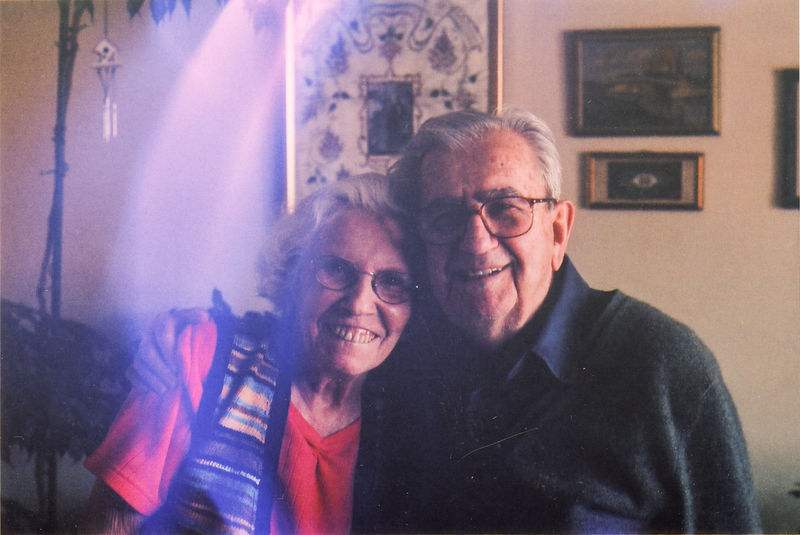
I’ve started to worry that I haven’t asked enough questions, that there will never again be enough time, and that my parents are bound to take a part of me with them when they go.
Sobering thoughts this Father’s day to remember to spend time with your parents. They are jewels.

By liking everything, I turned Facebook into a place where there was nothing I liked. To be honest, I really didn’t like it. I didn’t like what I had done.
Some of my favorite places to find good fonts are listed below. I have listed a few popular and storied foundries with a wide selection first, then listed more specific independent foundries second.
These larger foundries offer fonts ranging from the classics to new work from many famous contemporaries in the field of type design today.
Darden, Okay, House, and Sudtipos are great places to find display and specialty typefaces that are very extensive and well crafted. Don’t miss the cursive scripts from each of them. The ligatures and extended features are very exciting.
Their Mrs. Eaves font has held up through fad and fashion very well.
This Czech foundry is a little under the radar, but their recuts of Baskerville and Walbaum are exquisite. They've done a fantastic job modernizing classic types like those and others. They also have a few in-house fonts they've designed based on Czech morphologies that I'm dying to use on a future project.
Foundry’s serif fonts are some of the best, and would be very well suited in editorial or print work.
After the messy split with Hoefler, Tobias launched his own foundry and offers one font currently. You’ll also find some of his pre-Hoefler work on Font Bureau.
Based out of Copenhagen, these guys have fun and quirky type great for branding. I’ve used them on a few projects.
These Swiss foundries have very clean and sophisticated fonts with flair and whimsy built at a very subtle (or not so subtle) level. I haven’t used any of their work yet, but I can see the potential.
A bit underrated compared to other small shops, I’ve found their type to be very well suited from practical UI needs to distinct branding uses.
The fonts here are expertly crafted and you can almost never go wrong using them. Their attention to detail and the craft of creating type is very evident. They're a powerhouse for good fonts, as they cover every major category well.
The typefaces here are great. They’re boutique but very popular and also do commissioned type work quite frequently.

In this case, though, pups born to mice on American-type diets — no fiber, lots of sugar — failed to acquire the full endowment of their mothers’ microbes.
May 2016 update: there has been additional reporting on the gut by FiveThirtyEight.
There has been a rise in studies discussing the importance of the microbes that live in our gut and their primary food source: fiber. The “Burkina Faso microbiota produced about twice as much of these fermentation by-products, called short-chain fatty acids, as the Florentine [citizens]. That gave a strong indication that fiber, the raw material solely fermented by microbes, was somehow boosting microbial diversity in the Africans.”
This biodiversity of microbes in our gut can wax and wane depending on what we eat so that “[e]ven after weeks on this junk food-like diet, an animal’s microbial diversity would mostly recover if it began consuming fiber again.” That said, as quoted above, if a child does not eat the right diet at birth, she is at risk of never recovering the full biodiversity of her mother’s gut. Over generations, you have disparities in gut health from region to region across the globe that may not be recoverable.


Sculpture caught in the setting sun at the Thorvaldsens Museum. Copenhagen, Denmark.
[The] hipster onslaught has now … been over-run by Ivy League business school marketing grads, violently jogging ex-cheerleaders from the Midwest, Bonobos-sporting former frat bros, and Baby Bjorned global arrivistes …
This Halloween in San Francisco has been by far the tamest and least quirky of all my years here, and after you read the piece above, you know the end is near for the wild days of yesteryear.

There is repetition everywhere, and nothing is found only once in the world.


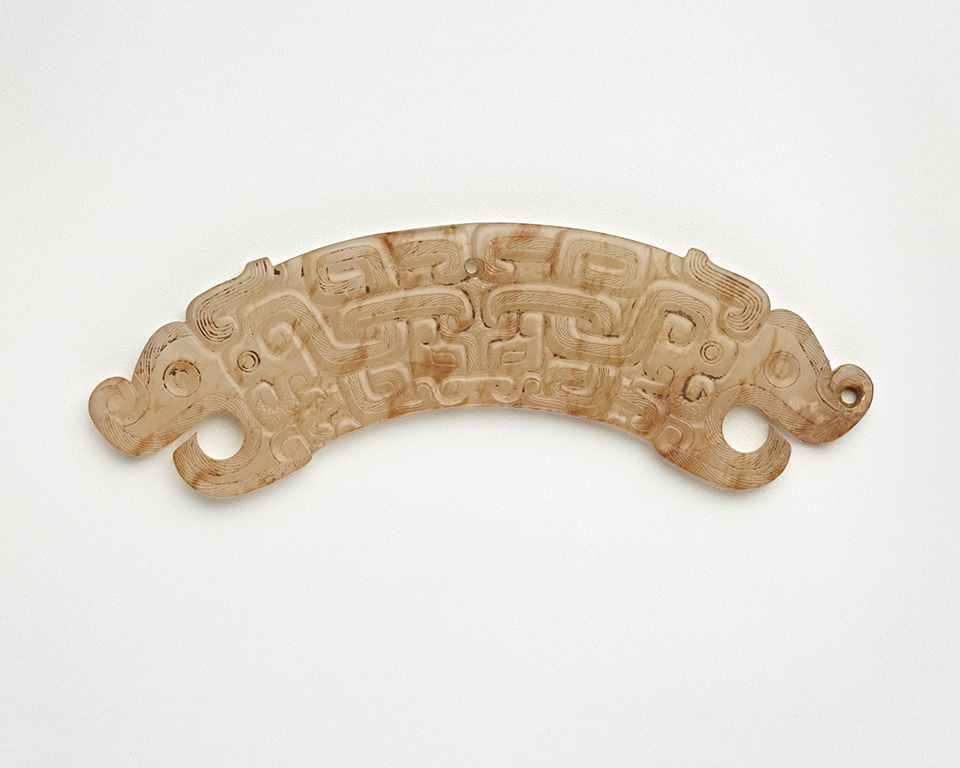

A collection of sublime jade objects from the Freer & Sackler Galleries of the Smithsonian. Jade — for all its popularity as a green stone — is strikingly colorful. Jade covers nearly every hue, and we would do well as artists to take advantage of these characteristics. Jade isn’t just green after all.
… art isn’t a phenomenon to be explained. Not by neuroscience, and not by philosophy. Art is itself a research practice, a way of investigating the world and ourselves.
Er ist ein Prince … Mehr! Er ist ein Mensch.

… because we often read Mozart’s music with lenses adjusted to Beethoven’s “heroic-style” … we sometimes overlook that Mozart’s slow movements are conceived as the gravity center [and] are indeed “central” in the most fundamental sense.
There is no excellent beauty, that hath not some strangeness in the proportion.
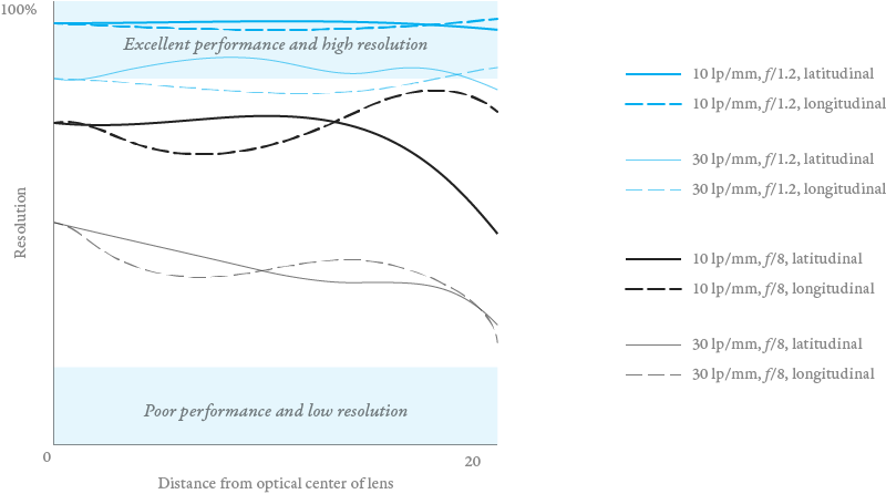
MTF charts help to objectively explain the quality and performance attributes of a lens. The charts plot the ability of the lens to distinguish between evenly spaced black lines in a one millimeter space. This resolving power is referred to as line pairs per millimeter (lp/mm).
10 line pairs per millimeter and 30 line pairs per millimeter are most commonly used. Some charts will show 40 lp/mm. The camera manufacturers will display these lines on the graph in various colors and thicknesses, so check the key to decipher their system.
Even so, you can read these charts fairly quickly from left to right and up to down. These charts are very helpful to see how your lens might perform and compare it against qualitative reviews from photographers. For example, the Canon 85mm prime lens performs exceptionally well at the widest aperture: it preserves high resolution from the absolute center of the lens all the way to the outer edge of the glass with excellent defocusing. You can see that in the MTF chart above in the top blue line. There is very little deviation of line resolution from center to outside. Both the latitudinal (lines parallel to the radius of the lens, shown as solid lines on the graph) and longitudinal (lines perpendicular to the radius of the lens, shown as dotted lines on the graph) lines on the graph match for the largest aperture opening. This lens is well known for it’s beautiful blur (bokeh) and extreme sharpness at wide apertures. However, the graph also reveals that the lens performs quite poorly when shot at an aperture of f/8. Even at the center of the lens, the resolving power for 30 lines per millimeter drops from around 82% to 48%, and continues losing resolution the farther from the center. What this means is that the lens is more a specialty piece than general purpose, and that you should not expect good performance from this lens at smaller apertures.
When looking at these charts quickly, keep these points in mind:


A society grows great when old men plant trees whose shade they know they will never sit in.

I was about 14 years old at the time, and I was coming along with my mother on our weekly visits to see Cicianne and Nasut Dede. I was excited for two reasons. The first one was that Cicianne would make her hallmark ice cream: huge mounds of chocolate ice cream covered in all sorts of wonderful toppings — almonds, cookies, bananas, cherries, raspberries form the garden, self-made jams and preserves. It was a treat every weak.
But secondly, I was eager to show Nasut Dede a painting I made. I bashfully opened up the watercolor book and showed him the still life of an eggplant. “Good,’ he said. Now being a teacher of gentle patience, Nasut Dede was also very economical with his words: “but your lines for the table are crooked. Draw a line for me.’
I drew a line for him across the page. It wasn’t straight, and I thought I could just use a ruler.
“You don’t need a ruler,’ he said. “When you draw a straight line, you always look to where the line is going to be. Not where your line currently is.’
So I took the pencil again and this time stared ahead of the line and let my hand lead itself in the right direction. The line was now straight.
There are a few people in my life that I will never forget and never wish to see leave this world. I miss both Nasut Dede and Cicianne dearly and am reminded of them nearly every day. Their impressions live on in my memories, as clear as when I was with them, and I have been forever grateful to have know them.

There is a deluge of “creative” free time most college-educated people have. If Uber and Postmates (and countless others) successfully captured the low-end extra work potential of unskilled labor, then there is still a huge potential to capture the high-end extra work potential of skilled labor. Enter in the need for services that let people get “on-demand” services or products from skilled people.
We are seeing it in services like EyeEm and Snapwire, aimed at photographers. And we will be seeing more of it in other skilled professions.
If you haven’t heard, a cooking robot and IBM’s Watson can now cook better than you.
This is interesting because we have to load machines with a basic set of assumptions, and because of the accuracy of machinery and their long-term memory, they essentially will never forget these assumptions.
For example, if you were teaching a robot how to write, you would teach it the difference between your and your’re. This is a pretty standard grammar rule that I very often forget or ignore, leaving my writing pot-marked with errors.
Though that example is banal, if we look at localization, evolution, and culture: most “innovations” or differences arise either from error, accident, or deliberate changes to a set of assumptions.
The problem is, do we risk freezing culture at a point in time when we load our assumptions into the robot’s machine learning? Or are the scientist clever enough to introduce randomization and evolution into the machine learning? The problem is, how do you teach a robot to be both accurate but also open to doing things “wrong?” — the hallmark of creativity and innovation.

The thing about being sick and single is that you have no one to make chicken soup for you.
I had a Blue Apron recipe ready to make, fortunately. They portion and package all the ingredients I needed to make this soup. I still had to chop the vegetables, but it turned out wonderfully. In the future, I might find it hard to find Canton noodles or have chicken demi-glace (demi-glace au poulet) on hand. And they also forgot to include the red curry paste. Considering my throat was burning, I didn’t need extra spice anyways. Once finished, this soup really hit the spot and helped me feel much better.
| 8 ounces | chopped chicken thighs |
| 3½ ounces | Canton noodles |
| 4 ounces | white mushrooms |
| 3 gloves | garlic |
| 2 | scallions |
| 1 | green bell pepper |
| 1 | lime |
| 1 | bunch cilantro |
| 3 tablespoons | chicken demi-glace |
| 2 tablespoons | red curry paste |
| 2 teaspoons | Worcestershire sauce |
| 1 inch | piece of ginger |
Wash and dry the vegetables. Slice or quarter the mushrooms. Peel and mince the garlic and ginger. Thinly slice the scallions, keeping the white and green parts separated. Slice the green bell pepper into long strips and discard the inside seeds and stem. Zest the lime to produce about 2 teaspoons of lime zest. Be careful not to get the bitter ring underneath the green flesh. Quarter the lime and save for garnish later. Pick the cilantro leaves off the stems.
Pat the chicken dry with paper towels and season with salt and pepper. In a medium pot, heat about 2 teaspoons of oil on medium-high until hot. The oil will be less viscous and shimmer when it is warm enough. Add the seasoned chicken and cook, stirring occasionally, 4 to 6 minutes, or until browned on all sides. Transfer to a plate, leaving any browned bits (or fond) in the pot.
In the same pot, add 2 teaspoons of oil to the reserved fond. Briefly heat on medium-high heat until hot. Add the mushrooms and cook, stirring occasionally, 2 to 4 minutes, or until browned. Add the bell pepper. Season with salt and pepper. Cook, stirring occasionally, 1 to 2 minutes, or until the bell pepper has softened slightly, but isn’t completely cooked. Add the garlic, ginger, white bottoms of the scallions, and lime zest. Cook, stirring frequently, 30 seconds to 1 minute, or until fragrant. Be careful not to burn the garlic during this process.
To the pot of vegetables, add as much of the curry paste as you’d like. Cook, stirring frequently, 30 seconds to 1 minute, or until toasted and fragrant. Add the chicken demi-glace, Worcestershire sauce, and 5 cups of water. Stir in the browned chicken (along with any juices from the plate). Heat to boiling on high. Once boiling, reduce the heat to medium and simmer, stirring occasionally, 5 to 7 minutes, or until slightly reduced in volume.
Add the noodles to the pot of soup. Cook, stirring occasionally, 2 to 3 minutes, or until the noodles are tender. Turn off the heat and stir in the juice of 2 lime wedges. Season with salt and pepper to taste.
When finished cooking, serve and garnish with the green scalliong tops, cilantro, and lime wedges. If you hate cilantro, like I do, then just skip that part.

An engineer is a problem solver. A cultural engineer uses culture (philosophical, material, social, political, artistic) to solve problems. In that sense most humanities or “soft” fields of study can all be considered cultural engineers as they use do not use purely scientific or mathematic solutions to solving problems. They work inside other bodies of theory.
These “solutions” take their cues from anthropology, sociology, philosophy, and aesthetics for the most part. Here are some rough examples:
These are merely top-of-the-head categories, which are useful insomuch as I jotted them down in this post. The more important point is that these fields of study borrow from mathematics and science but ultimately don’t need to obey their rules. They don’t need, for example:
In fact, the idea of proving anything is debatable. Indeed, and especially, for aesthetics, proof is nearly a non-issue. Personal agency and force are more legitimate.
In anthropology and sociology, a single incident or case, or study, can pave way for validity and general acceptance, even without repeatability. By the very nature of the communities studied in anthropology, often repeatability of findings is impossible.
And in philosophy — a field I know little about — I will venture forward and say that many things have been argued quite elegantly in the course of time: from forgotten scrawls to major systems of thought like religion. These can range from highly systematic and “scientific” to requiring Kierkegaardian “leaps of faith” when some things are left unexplained. But all of which have seemed to find someplace in the philosophical canon as “legitimate” or “true.”
But rather than make this seem like I am pointing my finger at these broad fields of study to exclaim, “Look! Look at their fallacies, imprecisions, and false idols. Can they be trusted?” What I really mean to say is that their approach to problem solving is different from science and math (the original bastions of an engineer’s thought process), but not at all necessarily weaker or less valid.
And I cannot emphasize enough, these are certainly not a replacement or usurper to math or science.
In fact, that is why a cultural engineer is a particularly relevant position: they are poised to transform technology from a scientific and mathematic phenomena of problem solving into an uncharted world of culture and social significance only because they draw on the rules of those fields — and not math and science — as further areas of understanding for the engineer: as their points of departure, and as their tools to solving greater engineering problems than previously encountered.
And it is my hope, that by pulling from cultural systems of understanding that technology can be transformed in unforeseen ways but hopefully in ways that better humankind. I feel like the well of science has run dry in helping to guide technology to make us better, and perhaps we should feel free to take cues from elsewhere when solving issues of the engineer.
I despise plastic.
And yet, plastic is the true technologist material. Like a stem cell, you feed instructions to the plastic: this is what you shall be and it is so. Plastic can be soft, hard, woven, carved, flexible, rigid, biodegradable, permanent. We will find “higher quality” materials like metal and glass increasingly anachronistic for the purposes of technology, especially advanced technology. And as technology will drive the fortunes of other disciplines, they will have to follow its march. Well, now is the time to begin to appreciate plastic aesthetically.
London’s taxi driver test enshrines knowledge as — to use the au courant term — an artisanal commodity, a thing that’s local and homespun, thriving ideally in the individual hippocampus, not the digital hivemind.
Consider this scenario: a engineer is working on a project and finds another engineer has worked on something similar but has a better solution. This other engineer shared his solution on his blog. The code is open-sourced. The engineer grabs that code, and uses it. This is a fairly common, and not really falling under any scrutiny, as far as I am aware.
Now, a designer is working on a project and finds another designer has worked on something similar but has a better solution. This other designer shared his solution on his blog. The designer grabs the design and uses it.
Whereas for the engineer, this is common practice, for the designer it is not as reputable. If the designer were to share his work and let it be known that it is from someone else, his talent would diminish. My question is: do engineers ever feel similarly about this? I for one feel less authentic and less skilled if I use a template file. Even if I remake that template from scratch following the same steps I feel more satisfied: much like a musician playing Mozart or a chef using an established recipe: even when the steps are copied, variation and innovation seem to occur. When something is copied wholesale — even with tacit encouragement from the creator — the mutation of creativity does not seem to occur.


The world in general disapproves of creativity, and to be creative in public is particularly bad. Even to speculate in public is rather worrisome. The individuals must, therefore, have the feeling that the others won’t object.

Online images seem to acquire a “patina” of sorts as they pass through the hands of many websites — each time being saved and re-compressed as a new image that is in fact very old. Indeed, JPEG compression is one of the few ways to tell that an image is old and circulated, without actually knowing the creation date of the image. JPEG compression enforces aging, since this compression is applied everytime an image is saved in that format.
We can appreciate the patina of modern materials like plastic, which now form a large part of the material culture in which we live. Now personally, I still find plastic and especially aged or old plastic to be nothing worth appreciating; however, as these materials are increasingly common in our visual landscape we have to create a visual language and appreciation of them in order to increase their beauty, longevity, and usefulness to us. In a way, we are using aesthetics to improve consumption. Though I would naturally be inclined to argue that there is no inherit beauty to old plastic, I can’t be sure if that is actually true or just true today, since there isn’t “connoisseurship” around aged plastic like there is around aged wood or metal. A large part of aesthetic appreciation is taught to us by various authorities and the marketplace that exists for things. Nothing new there.
So then, can we appreciate age in a digital world? And does an aesthetics of age even have a place in the digital landscape? In a digital world, age is almost non-existent: the physical objects that store data do age, but it does not manifest itself on the data. If we apply aesthetic rules for “old” things on the internet, we may or may not find anything useful there. Computers stamp a creation date, but I'm speaking more to age as interpreted through aesthetics and the visual field. For example, a more heavily compressed image would have a greater “patina” and thus be considered more precious. There is some silliness in this as to how easy it is to compress images instantly as opposed to actual age taking place through long periods of time.
Automatic JPEG compression is a happy accident, in my mind, that mimics the real world: a technical manifestation that things will age regardless of what we want or do. Based on an algorithm, certain data within the image is simply discarded forever and saved nowhere much like old materials that lose varnish or paint. JPEG images, each time they are saved, will “age” regardless of what we do: it’s built into its algorithm.
Then I wonder, is an older JPEG more beautiful than a new one? Is their something their to appreciate?
Let’s say you are being sent data from all over the world. But what if you get data in all sorts of odd capitalization? For example:
Use CSS like that below to correct these common capitalization discrepancies.
p {
text-transform: lowercase;
}
p:first-letter {
text-transform: uppercase;
}
This takes the whole string inside the element and down-cases it for a uniform letterset, then it capitalizes the first letter using the pseudo-class first-letter.
Full snippet below:

We are very familiar with the em unit in CSS (which counter to traditional print typography measures the font’s point size or height not width), but have you ever used the ex unit? It is defined as the x-height of a font, which is the height of its lowercase letters.
Ex unit expression can especially be useful for content-heavy sites, in which case, you can preserve alignment and font-rhythm much more consistently without relying on cumbersome line-height calculations, which can also allow better control with mixed font designs.
For example, 1.8 is usually considered a good measure for line-height. If you have the ex height, you can simply set the line height as 1.8 × ex.


Other venues include the Mozartkirche in Biberbach, where the eight-year-old took part in one of those organ-playing competitions children seemed to be forced into in the 18th century…
There is no question that, in a blind test, luxury goods are overpriced. That’s the definition of luxury goods. They are not better in terms of measurable engineering specs. They are better because they are scarce.
Godin misses the point here — he’s rehashing an Econ 101 text on what a luxury item is. Any kitchen-table conversation can get that far. What he’s missing is that the luxury isn’t meant for the consumer — the luxury is meant for the business: the business has the ultimate luxury in that it can assign any price to the item, and people will pay for it. Make your price as high as you need to support every other endeavor in the business. You then have complete license to create the best. There are no concessions or compromises.
And that is magical. It is a model we want to preserve, because there are no other businesses or industries where cost is not an issue. It does not matter who these luxury brands are: Chanel can close its doors tomorrow. It matters that artists and craftsman have an option to create the best without the typical constraints of a business. That is luxury.

When designing for megamenus or writing web copy in general, don’t put filler or nonessential words first: this prime location should be reserved for the most information-bearing verbiage and nothing else.
Update: further discussion on this topic at Designer News
I was going over the SCSS documentation after finding some curious SCSS I was unfamiliar with. Did you know you can generate a CSS rule based on the existence of a parent class without having to nest that CSS within the actual parent?
In CSS, you can only scope an element or class based on its parent if that CSS is embedded within that parent like:
.parent .child {
background: red;
}
With SCSS, you can re-create this scope without the nesting:
.child {
.parent & {
background: red;
}
}
This can be useful for browser-specific scraping, responsive design elements, or when you find the organization clearer by keeping the child’s style variations centralized rather than scattered ’cross your stylesheets.
Did you know (I didn’t) that CSS can read the text out of a data-attribute in HTML? If this is your html, <div data-today="Currently reading">Vanity Fair</td>, you can populate the data attribute into your CSS through content:
div[data-today]:before {
content: attr(data-today)": ";
}
It is surely nothing less than martyrdom to a man of cosmopolitan sympathies, to absorb in silent resignation the news of a country town?
Lippicott says good brands have signature cues that concentrate a brand into something tangible and can fundamentally be considered as a sign or signifier of the whole business. What is signified can vary dramatically. Examples form Lippincott include:
Feedback is what our customers are telling us. Product is what we are telling our customers.
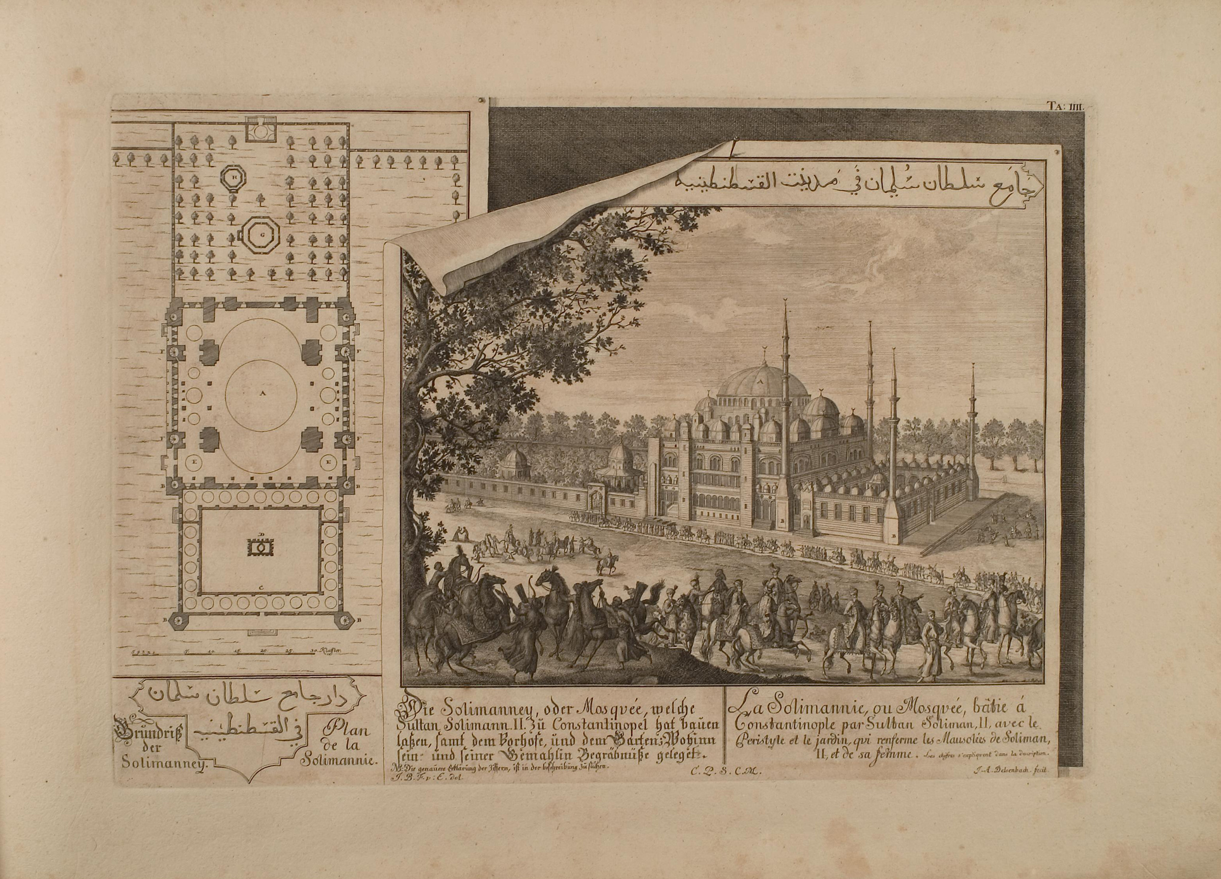
One common example of skeuomorphic design mentioned by designers is the simulation of paper texture on the screen (Apple being the most common user of this aesthetic). What you may not realize is that the simulation can go even farther in our visual past. Above is just one example.
This is an etching printed on paper, but the etching simulates curled paper on the top left corner. Simulating paper on paper itself? You might as well simulate pixels on a computer screen.
The etching is a view of the Süleymaniye Mosque built in the Ottoman Empire in the sixteenth century.

Digital decay does not refer to how information is lost. Instead, it describes a deliberate process or belief by which content (information) is actively destroyed or neglected, as to prevent a glut of content.
One assumption of this is that there is a such thing as the trivial or unimportant, and its very existence is a burden — regardless of the cost or availability of space and resource.
The historian or curator now relies on a computer to first sort information before even approaching it because of the vastness of data. But can the initial sorting by the machine be flawed? In another case, the user of a piece of software can be overwhelmed by his own data-creation. Should the software have built in ways to eliminate data?
If you love somebody, let them go, for if they return, they were always yours. And if they don’t, they never were.
Digital decay does not refer to how information is lost. Instead, it describes a deliberate process by which content (information) is actively destroyed, as to prevent a glut of content. How will a historian understand this time if the amount of content produced can only be processed initially by non-human means?